
JERA Program Logo
Our Client
JERA Americas
Project
Logo Design
Project Details
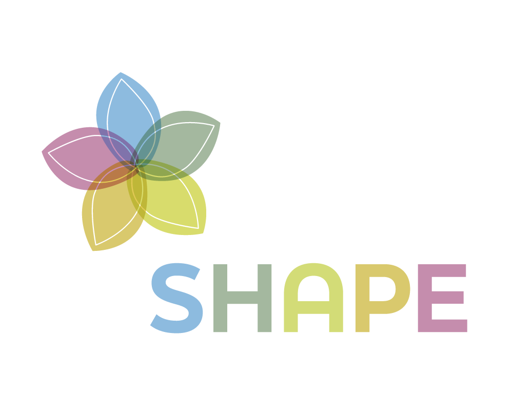
JERA Americas needed an internal brand for their EHS program, "SHAPE". The logo needed to represent their key pillars of sustainability and have an organic look. Mungo presented three original concepts and the flower concept was selected.
The logomark is a radially symmetrical flower assembled from an organic line form. The botanical element and symmetry suggest a feeling of harmony while the spectrum of color indicates balance.